Over the last few years, a new buzzword has been climbing the ranks of the web development lexicon. Mobile first. What is mobile first?
Before we can understand exactly what mobile first is, we need to take a look at responsive web design.
The responsive web
Do you remember when websites had separate “mobile” and “desktop” websites? We do and that was disgusting. Responsive web design solved the issue of maintaining multiple websites for different screen sizes by creating one website that adjusted it’s content and layout based on screen resolutions. It did this using CSS media queries (you don’t need to understand this) that allowed developers to style websites based on their dimensions
So what is it?
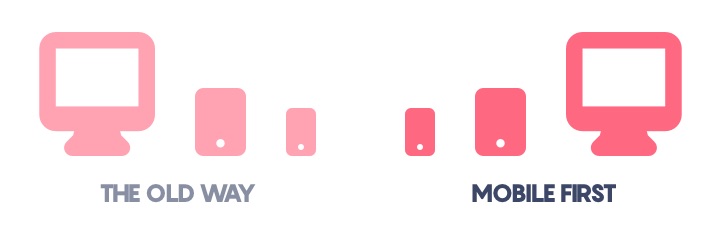
So that brings us to mobile first. Originally in responsive web design, developers would build out the complex features of a desktop experience first. Then they would add extra rules to morph and modify that experience into a mobile experience. In recent years as mobile device usage has overtaken desktop usage, designers and developers have reversed that process to build out the mobile experience first – hence the term mobile first.
There are a couple of reasons why mobile first has taken off. As mobile device usage overtakes desktop usage, it’s important for designers to reallocate their attention from desktop to mobile.
Mobile first websites perform better
From a technological perspective, mobile first development allows for better-performing websites. Early responsive web developers built out the desktop version of the website and then added special rules to modify the website to work on a mobile device. In mobile first development, we reverse the process and build out the website with a smaller amount of code dedicated to mobile devices. We then expand on that code for larger and larger devices. This works well because larger devices like tablets and desktops tend to have more processing power, making them better-suited to handle the additional rules applied for their screen sizes.
Search engine optimization (SEO)
Switching to a mobile first website can help improve your search engine rankings by two different ways. Google recently switched to mobile first indexing. This means that your website will be assigned its Google rankings based on the mobile version of your website. A mobile first approach ensures that you’re presenting the full version of your website on mobile devices. The second way that mobile first can help improve your search engine performance is by improving your page load times – which is an important Google ranking factor.
The future
Additionally, mobile first development is more future-proof than traditional responsive web development. Since we’re working from smaller devices and working our way up to larger devices, it allows us to more easily add code to make your website look great on 4K screens and even larger in the future.
There’s no getting around it. Mobile first is the way of the future and it’s here to stay.