Let’s take a moment and jump in the wayback machine to dig through some of our life’s most meaningful memories. Breeeeeaaathe. Remember the first time you drove a car. Remember the first time you got a boyfriend or girlfriend. Remember the first time you made eye contact with your newborn. Remember when you got down on one knee and asked her to marry you, and she said yes. Remember when you got your first touchdown, or you won something big.
Now, what do all of these things have in common with the top of your dealership website’s home page? They’re all equal in importance – or at least that’s how it might seem to you. That segway was ridiculous, I’m sorry.
However, the top of your homepage sees more traffic than anything else on your website. That means that it should be very important to you how it looks and performs. You’ll find a lot of information on the internet that compares the performance of image sliders and hero images (hero images > image sliders), but what about a multi-feature layout?
A multi-feature layout is a grid of organized information that features more than one thing in a static way. This combines some of the benefits of a slider with the benefits of a hero image. We’ve been noticing a trend towards multi-feature layouts around the web and created a little bit of a comparison between the three main options.
Image sliders

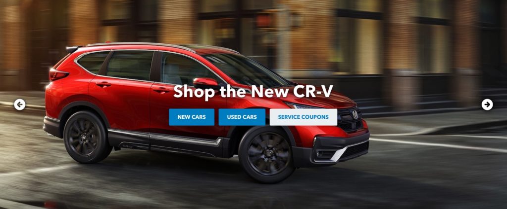
An image slider is exactly what you’d imagine. It’s a slideshow of images that automatically or manually cycles to show multiple images. Dealership websites often use sliders to feature multiple different offers – often one offer per slide. One of the attractions to using an image slider is that the dealership’s management often “feels” like they’re getting their offers out there by putting more content on the slider of their homepage. The reality is that they’re actually less performative than the other options.
Pros
- Big images
- Features multiple things
- Easy to maintain
Cons
- Needs different images for mobile and desktop
- Converts less than other options
- Automatic movement reminds users that they’re ads
- Code-heavy (slower load times)
- Image-heavy (slower load times)
Heroes

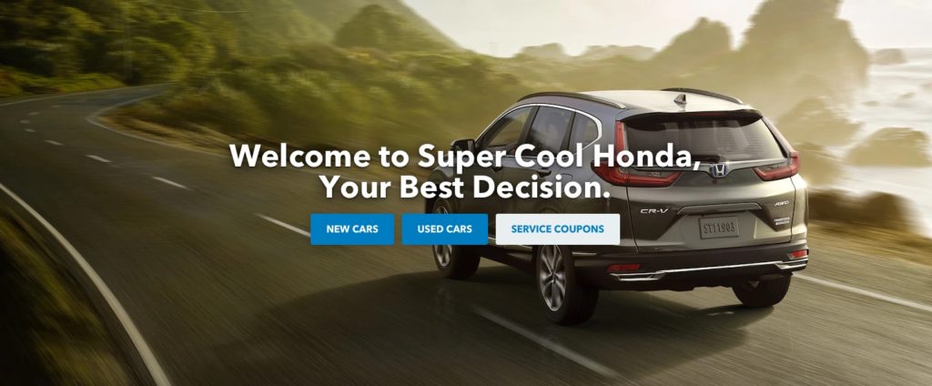
A hero image is a big ol’ image, usually full-width and frequently full height that shows off one big offer. We prefer to layer text on top of a background image for our heroes. This allows Google to read actual text and allows us to make the hero look good on all device sizes. Heroes are more effective than image sliders, but we find that dealerships offer a little bit of pushback because they feel like they need to put up more content. More… More… MORE!!! However, remember that everyone and everything is competing for your user’s attention. Offer clear pathways to high-converting content and make sure the users are able to find what they’re looking for.
Pros
- Big images
- Very easy to maintain
- Converts well
- Less code than a slider (quicker load times)
Cons
- Features one thing
- May need different images for mobile and desktop
Multi-feature layout

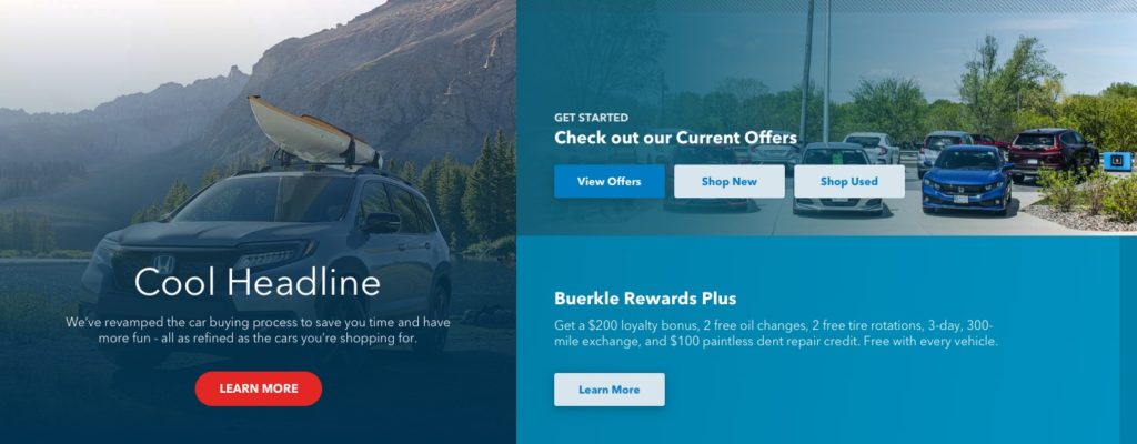
The new kid on the block – or maybe not who knows. Multi-feature layouts are static layouts (unchanging) that feature multiple different pieces of content in a hierarchical way by order of importance. This satisfies a couple of key issues in that we can show one, big, grabby image that features content related to the most important thing happening now, and a couple supplementary pieces of content that may not be as important. These layouts share the loading-speed benefits of heroes and the ability to feature multiple bits of content like sliders.
Pros
- Features multiple things without looking like an ad
- More content above the fold without being overbearing
- Very mobile friendly in layout and uses less code than a slider
Cons
- No big images
- Limited text area